lightning:dualListbox In Lightning Component
In this blog we are going to learn about lightning:dualListbox in lightning component. This lightning component is used as multiple select list which includes two multiple select list. Left list represents list of available options and right list represent list of selected options. We can move these options from one list to another list and selected options can be ordered. Let’s learn how to use this.
Attributes
First of all, let’s learn about its attribute which we going to use in the example.
- name : It is required attribute. It specifies the name of input element.
- value : It specifies the value of input element.
- label : Label for dual list box component. It is required.
- variant : It is used to show or hide the label of the component. Possible values are standard and label-hidden.
- disabled : Specifies that the input element should be disabled or not. Default is false.
- readonly : Set readonly property of input element. Default is false.
- required : Set the required property of the input element. Default is false.
- validity : Define the validity of the component with respect to validation parameters.
- onchange : Action triggered on this event.
- onfocus : Action triggered on this event.
- onblur : Action triggered on this event.
- sourceLabel : Label for options list box.
- options : List of options which are available for the selection.
- requiredOptions :List of options which cannot be removed from selected options.
- min : minimum number of that is required for selection.
- max : maximum number of that can be selected.
- values : List of selected option.
Example
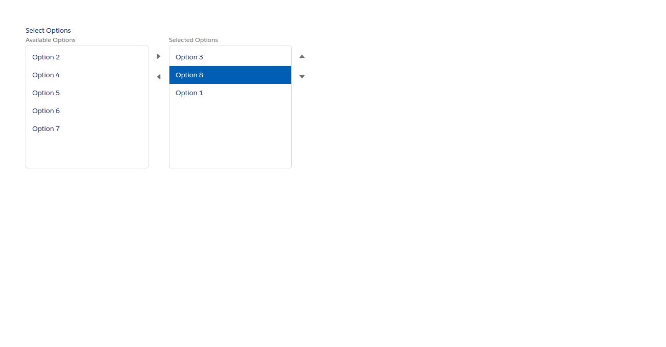
In this example we have a set of options from which we can select, required option which cannot be removed from selected list and selected values.#Component :
<!-- /**
       * Webkul Software.
       *
       * @category Webkul
       * @author Webkul
       * @copyright Copyright (c) 2010-2017 Webkul Software Private Limited
          (https://webkul.com)
       * @license https://store.webkul.com/license.html
       */ -->
<aura:component implements="force:appHostable,flexipage:availableForAllPageTypes,flexipage:availableForRecordHome,force:hasRecordId,forceCommunity:availableForAllPageTypes,force:lightningQuickAction" access="global" >
 <aura:attribute name="listOptions" type="List" default="[]"/>
 <aura:attribute name="defaultOptions" type="List" default="[]"/>
 <aura:attribute name="requiredOptions" type="List" default="[]"/>
 <aura:handler name="init" value="{! this }" action="{! c.initialize }"/>

 <lightning:dualListbox aura:id="selectOptions"
 name="Select Options"
 label="Select Options"
 sourceLabel="Available Options"
 selectedLabel="Selected Options"
 options="{! v.listOptions }"
 value="{! v.defaultOptions }"
 requiredOptions="{! v.requiredOptions }"
 onchange="{! c.handleChange }"/>
</aura:component>
#Controller
({
    /**
     * Webkul Software.
     *
     * @category Webkul
     * @author Webkul
     * @copyright Copyright (c) 2010-2017 Webkul Software Private Limited (https://webkul.com)
     * @license https://store.webkul.com/license.html
     */
    initialize: function (component, event, helper) {
        var options = [
            { value: "1", label: "Option 1" },
            { value: "2", label: "Option 2" },
            { value: "3", label: "Option 3" },
            { value: "4", label: "Option 4" },
            { value: "5", label: "Option 5" },
            { value: "6", label: "Option 6" },
            { value: "7", label: "Option 7" },
            { value: "8", label: "Option 8" },
        ];
        var values = ["3", "8", "1"];
        var required = ["1", "8"];
        component.set("v.listOptions", options);
        component.set("v.defaultOptions", values);
        component.set("v.requiredOptions", required);
    },
    handleChange: function (cmp, event) {
        // Get the list of the "value" attribute on all the selected options
        var selectedOptionsList = event.getParam("value");
    }
})
#Helper
   onChange: function (cmp, event) {
    // Retrieve an array of the selected options
    var selectedOptionValue = event.getParam("value");
   }
Output
Support
That’s all for lightning:dualListbox in lightning component , still if you have any further query or seek assistance to make your salesforce classic apps compatible with lightning experience, feel free to contact us, we will be happy to help you https://wedgecommerce.com/contact-us/.