Lightning Icon tag in Lightning Experience
When we develop in lightning experience handling the css part becomes much more easier. What if we don’t have to write css for icons we use at all? What if we just have to use a tag, and our icon appears just as we want? Yes, it is possible using lightning:icon tag. Let’s know more about this tag in detail.
Lightning Icon Tag
As I discussed earilier, we can add icons to our code using this tag. You can refer to lightning design system icons which you can use through this tag. Here is the link: https://www.lightningdesignsystem.com/icons
Now, let’s discuss about the attribute that we use in this tag. We will start with the required attribute first.
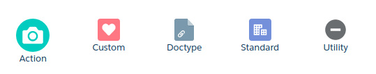
1) iconName: As the name suggest it is the name of the icon which is the only required attribute for this tag. It is written in the format category:icon.
There are mainly five categories of icons in lightning design system.
– Action
– Custom
– Doctype
– Standard
– Utility
Here is an example of each category:
<aura:application extends="force:slds">
	<!--
	/**
         * Webkul Software.
         *
         * @category  Webkul
         * @author    Webkul
         * @copyright Copyright (c) 2010-2016 Webkul Software Private Limited (https://webkul.com)
         * @license   https://store.webkul.com/license.html
         */
	-->
    <lightning:icon iconName="action:add_photo_video"  />
    <lightning:icon iconName="custom:custom1"  />
    <lightning:icon iconName="doctype:attachment"  />
    <lightning:icon iconName="standard:account"  />
    <lightning:icon iconName="utility:error"/>
</aura:application>
You can view how each icon would look like:
2) alternativeText: You can recognise it as assistive text or alt attribute of image tag.
3) class: Adds css to the outer element of the class.
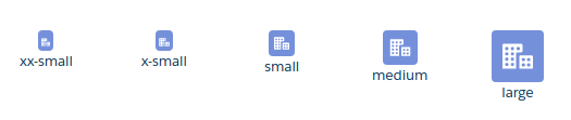
4) size: This describes the size of the element. There can be five values of this attribute which are mentioned below:
– xx-small
– x-small
– small
– medium
– large
Note: The default size is medium.
Here is an example of size:
<aura:application extends="force:slds">
	<!--
	/**
         * Webkul Software.
         *
         * @category  Webkul
         * @author    Webkul
         * @copyright Copyright (c) 2010-2016 Webkul Software Private Limited (https://webkul.com)
         * @license   https://store.webkul.com/license.html
         */
	-->
    <lightning:icon iconName="standard:account" size="xx-small" />
    <lightning:icon iconName="standard:account" size="x-small" />
    <lightning:icon iconName="standard:account" size="small" />
    <lightning:icon iconName="standard:account" size="medium" />
    <lightning:icon iconName="standard:account" size="large" />
</aura:application>
The view of the icons:
5) title: Title of the icon appears when you hover mouse over it.
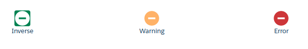
6) variant: This attribute is only applicable for utility icon. It changes the color of the icon. There can be three values of this attribute which are mentioned below:
– inverse
– warning
– error
Here is the example of variants:
<aura:application extends="force:slds">
	<!--
	/**
         * Webkul Software.
         *
         * @category  Webkul
         * @author    Webkul
         * @copyright Copyright (c) 2010-2016 Webkul Software Private Limited (https://webkul.com)
         * @license   https://store.webkul.com/license.html
         */
	-->
    <lightning:icon iconName="utility:error" variant="inverse" class="inverse-icon"/>//class attribute is used for adding background to view inverse icon
    <lightning:icon iconName="utility:error" variant="warning"/>
    <lightning:icon iconName="utility:error" variant="error" />
</aura:application>
Here is how the icons look:
Support
That’s all about lightning icon tag in Lightning Experience, for any further queries feel free to contact us at:
https://wedgecommerce.com/contact-us/
Or let us know your views on how to make this feature better, in comments section below.