lightning:dynamicIcons In Lightning Component
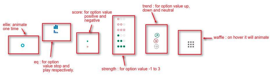
In this blog we are going to learn about lightning:dynamicIcons in lightning component. This tag represents animated icons and can be use to represent the current process which is running in background. These are of following type :
- Ellie
- Eq
- Score
- Strength
- Trend
- Waffle
We can use this component in API version 41.0 or above. Let’s learn about its attribute.
Attributes
It has following attributes :
1). type: LDS name of dynamic icons. It is required attribute.
2). option : To change the appearance of dynamic icons.
3). class : To style the icon
4). title : Display tooltip
5). alternativeText : used to describe the icon.
6). onclick : action triggered when icon is clicked
Example
<aura:component implements="force:appHostable,flexipage:availableForAllPageTypes,flexipage:availableForRecordHome,force:hasRecordId,forceCommunity:availableForAllPageTypes,force:lightningQuickAction" access="global" >
 <!--
 /**
 * Webkul Software.
 *
 * @category Webkul
 * @author Webkul
 * @copyright Copyright (c) 2010-2017 Webkul Software Private Limited (https://webkul.com)
 * @license https://store.webkul.com/license.html
 */
 -->
 <div>
 <div>
 <lightning:dynamicIcon type="ellie"/>
 </div>
 <div>
 <div><lightning:dynamicIcon type="eq" option="stop"/></div>
 <div><lightning:dynamicIcon type="eq" option="play"/></div>
 </div>
 <div>
 <div><lightning:dynamicIcon type="score" option="positive"/></div>
 <div><lightning:dynamicIcon type="score" option="negative"/></div>
 </div>
 <div>
 <div><lightning:dynamicIcon type="strength" option="-1"/></div>
 <div><lightning:dynamicIcon type="strength" option="-2"/></div>
 <div><lightning:dynamicIcon type="strength" option="-3"/></div>
 <div><lightning:dynamicIcon type="strength" option="1"/></div>
 <div><lightning:dynamicIcon type="strength" option="2"/></div>
 <div><lightning:dynamicIcon type="strength" option="3"/></div>
 </div>
 <div>
 <div><lightning:dynamicIcon type="trend" option="up"/></div>
 <div><lightning:dynamicIcon type="trend" option="down"/></div>
 <div><lightning:dynamicIcon type="trend" option="neutral"/></div>
 </div>
 <div>
 <lightning:dynamicIcon type="waffle" />
 </div>
 </div>
</aura:component>
Output
Support
That’s all for lightning:dynamicIcons in lightning component , still if you have any further query or seek assistance to make your salesforce classic apps compatible with lightning experience, feel free to contact us, we will be happy to help you https://wedgecommerce.com/contact-us/.