Changing State Of Button In Lightning Component
In this blog we are going to learn about changing state of button in lightning component. To perform this task, generally developer need to write certain lines of java-script code. But in lightning component we can do this task by just writing a component tag and defining some of its attributes. Following components can be used to change the state of the button.
- lightning:buttonStateful : By using this component we can change the button icon as well as button text on active and inactive button.
- lightning:buttonIconStateful : This tag use icon only button and can be used to retain the state. It requires API version 41.0 and above.
Let’s learn about attributes of above components :
Attributes
1). lightning:buttonStateful Attributes :-
- iconNameWhenHover : Name of the icon when hover on it. For example : utility:check
- iconNameWhenOff : Name of icon when state is false.
- iconNameWhenOn : Name of icon when state is true.
- labelWhenOff : Text when state is false.
- labelWhenOn : Text when state is true.
- labelWhenHover : The text to be displayed inside the button when state is true and hover event is triggered .
- state : State value of the button. It is boolean type. Default is off.
- title : Define tootip text.
- variant : To change the appearance of the button.Accepted variants include brand, destructive, inverse, neutral, success, and text. This value defaults to neutral.
- onblur : Action to trigger on blur event.
- onfocus : Action to be triggered on focus event.
- onclick : Action to be triggered on click event.
- class : CSS class to be applied an outer element.
2). lightning:buttonIconStateful Attributes :-
- iconNameWhenHover : Name of the icon when hover on it. For example : utility:check
- name : Name of button.Can be used to identify on callback
- size : Size of button icon. Accepted values xx-small, x-small, small and medium
- disabled : Button icon is disabled or not.
- iconName : Name of the lightninig design system icon to be displayed. Only utility category icon can be used here.
- selected : Button is selected or not value of the button. It is boolean type. Default is off.
- title : Define tootip text.
- variant : To change the appearance of the button. Accepted variants border and border-inverse. This value defaults to border.
- onblur : Action to trigger on blur event.
- onfocus : Action to be triggered on focus event.
- class : CSS class to be applied an outer element.
Example
Let’s create a component to toggle the button state.
# Component Code
<aura:component implements="force:appHostable,flexipage:availableForAllPageTypes,flexipage:availableForRecordHome,force:hasRecordId,forceCommunity:availableForAllPageTypes,force:lightningQuickAction" access="global" >
<!--
/**
* Webkul Software.
*
* @category Webkul
* @author Webkul
* @copyright Copyright (c) 2010-2017 Webkul Software Private Limited (https://webkul.com)
* @license https://store.webkul.com/license.html
*/
-->
<aura:attribute name="buttonstate" type="Boolean" default="false"/>
<aura:attribute name="enableWifi" type="Boolean" default="true"/>
<div>
<lightning:buttonStateful labelWhenOff="Like"
labelWhenOn="Dislike"
labelWhenHover="Like"
iconNameWhenOff="utility:like"
iconNameWhenOn="utility:dislike"
iconNameWhenHover="utility:like"
state="{! v.buttonstate }"
onclick="{! c.handleClick }"
class="stateClass"
/>
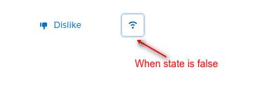
<lightning:buttonIconStateful iconName="utility:wifi"
selected="{!v.enableWifi}"
alternativeText="Wifi Enabled"
onclick="{! c.handleToggle }"
class="stateIconClass"/>
</div>
</aura:component>
# Controller Code :
({
 /**
 * Webkul Software.
 *
 * @category Webkul
 * @author Webkul
 * @copyright Copyright (c) 2010-2017 Webkul Software Private Limited (https://webkul.com)
 * @license https://store.webkul.com/license.html
 */
 handleClick : function (cmp, event, helper) {
 var buttonstate = cmp.get('v.buttonstate');
 cmp.set('v.buttonstate', !buttonstate);
 },
 handleToggle : function (cmp, event) {
 var enableWifi = cmp.get("v.enableWifi");
 cmp.set("v.enableWifi", !enableWifi);
 }
})
# CSS :
.THIS {
    width : 50%;
    margin : auto;
    margin-top: 30px;
}
.THIS .stateClass {
    margin : 20px;
}

.THIS .stateIconClass {
    margin : 20px;
}
Output
#When state is enabled.

#When state is disabled.
Support
That’s all for changing state of button in lightning component , still if you have any further query or seek assistance to make your salesforce classic apps compatible with lightning experience, feel free to contact us, we will be happy to help you https://wedgecommerce.com/contact-us/.