In this blog, I am going to show how to use the lightning:overlayLibrary component to create custom modals.This component requires API version 41.0 and later.
Modals can be used to display messages on the current app window by displaying a dialog in the foreground of the app, interrupting a user’s workflow and drawing attention to the message.
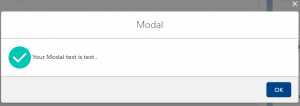
In the example given below, the modal displays the text written in the lightning input on the click of a button.The content of the modal can be formatted as per requirements.
In this example, following components are used:
Main Component (Modal.cmp) – Will contain lightning:overlayLibrary tag with aura:id attribute and a lightning:button to open the modal on click.
Modal Content (ModalContent.cmp) – This component contains all the content to show in the Modal as content.
Modal footer (ModalFooter.cmp) – This component contains all the footer part of the modal.
Modal.cmp
<aura:component implements="flexipage:availableForAllPageTypes,flexipage:availableForRecordHome" access="global">
    <aura:attribute name="modalText" type="String"/>
    <lightning:overlayLibrary aura:id="overlayLibModal"/>

    <lightning:input name="text" label="Modal Text" value="{!v. modalText }" />
    <lightning:button name="modal" label="ShowModal" onclick="{!c.showModal}"/>
</aura:component>
ModalController.js
({
    showModal : function (component, event, helper) {
        var modalText = component.get("v.modalText");
        var modalBody;
        var modalFooter;
        $A.createComponents([
            ["c:modalContent",{
                modalText : modalText
            }],
            ["c:ModalFooter",{}]
        ],
                            function(content, status){
                                if (status === "SUCCESS") {
                                    modalBody = content[0];
                                    modalFooter = content[1];
                                    component.find('overlayLibModal').showCustomModal({
                                        header: "Modal",
                                        body: modalBody,
                                        footer: modalFooter,
                                        showCloseButton: true,

                                        closeCallback: function() {
                                            console.log('You closed the alert!');
                                        }
                                    })
                                }
                            }
                           );
    }
})
ModalContent.cmp
<aura:component >
    <aura:attribute name="modalText" type="String"/>

    <lightning:icon size="medium" iconName="action:approval" alternativeText="Approved" />
    Your Modal text is {!v.modalText} .
</aura:component>
ModalFooter.cmp
<aura:component>
    <lightning:overlayLibrary aura:id="overlayLib"/>
    <lightning:button name="ok" label="OK" variant="brand" onclick="{!c.handleOK}"/>
</aura:component>
ModalFooterController.js
({
    handleOK : function(component, event, helper) {
        //closes the modal or popover from the component
        component.find("overlayLib").notifyClose();
    },
})